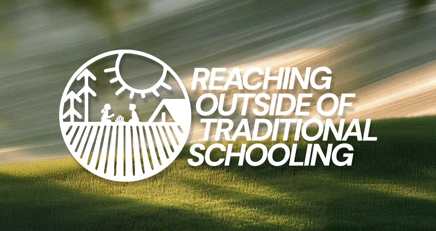
Our creative direction focused on authenticity and warmth. We designed a logo that felt hand-grown rather than manufactured—something that could live just as comfortably on a farm sign as it could on a child’s t-shirt or community flyer. The typography and organic lines evoke connection and balance, while the color palette draws from earth tones and natural textures found across their homestead environments.
More than a design exercise, this project was about giving visual form to a movement—one that helps children see learning not as a task, but as an adventure through nature. It stands as one of our most rewarding collaborations, celebrating a community committed to nurturing both roots and growth.


